Content

The Brief
This Living room project forms part of a larger house renovation project for a Victorian property.
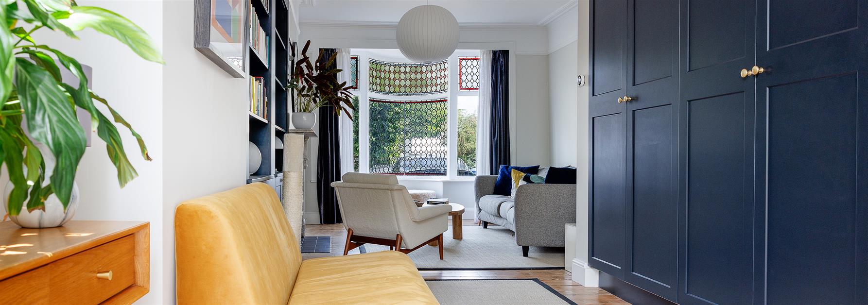
The brief was to make better use of the space and have clearly defined and usable areas. Much needed additional storage and bookcases were required.
About The Project

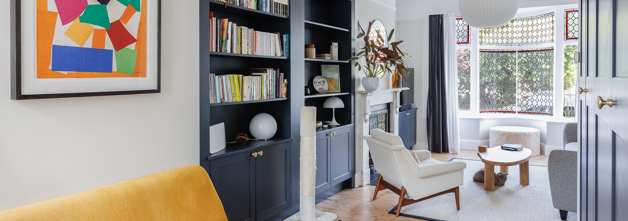
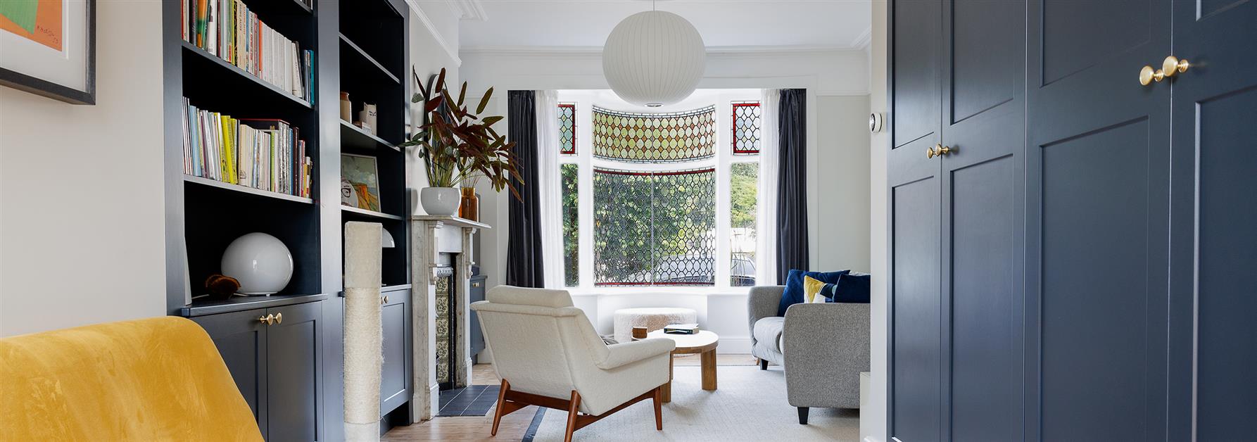
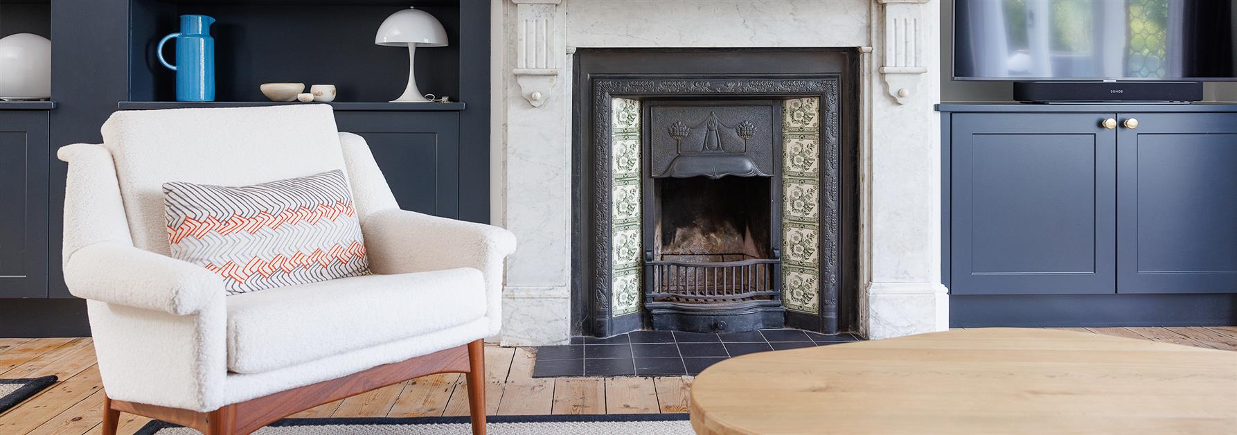
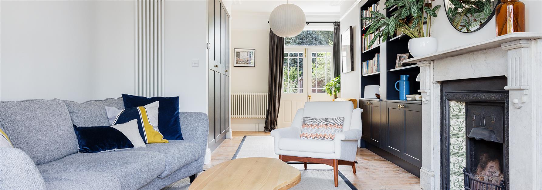
'‘The previous living room was originally two rooms that had been knocked into one, which created a rather long space with some awkward recesses and angles, including a curved wall and a beautiful curved window. This had made it difficult for my clients to fit in furniture and make full use of the space, and resulted in one end of the room being unused.
lintels. These built-in storage areas, together with the new made to measure ceiling coving and ceiling roses helped create newly defined and clean lines around the whole room.
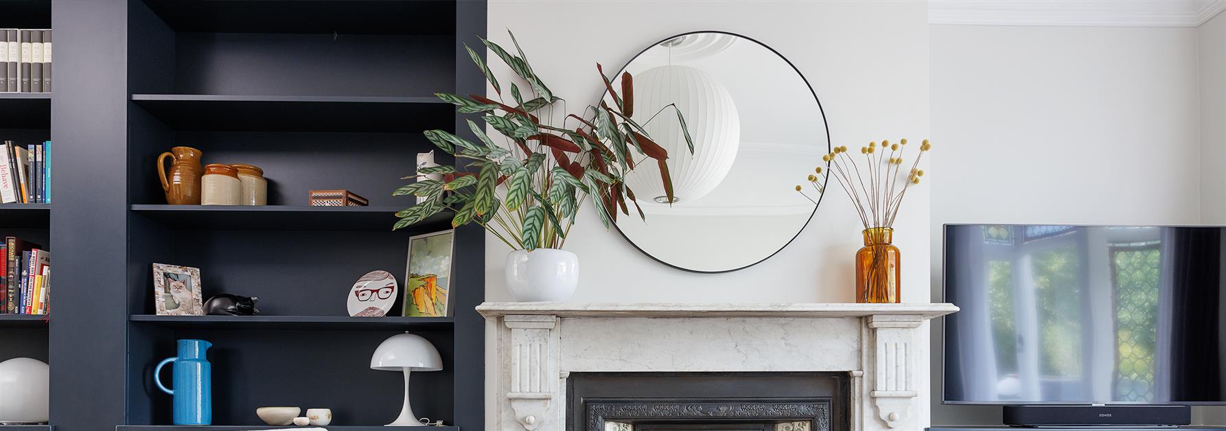
the wall added some pops of colour. The Herman Miller ceiling lights chosen by my clients provided a mid-century classic design element to the room that was both understated and beautiful.
I am delighted with how this room looks now, it seems to get better with each visit to the property!’
Rebecca Coulby

What Our Client Says
'Helen and I are both very pleased with the final result and are looking forward to using them in the months and years to come both for ourselves and with family and friends. They are both lovely spaces in different ways and once we have the finishing touches of some rugs, the coffee table and plant they will be beyond perfect.’
Mr T. Harris
Mrs. H Andrews

