Content

The Brief
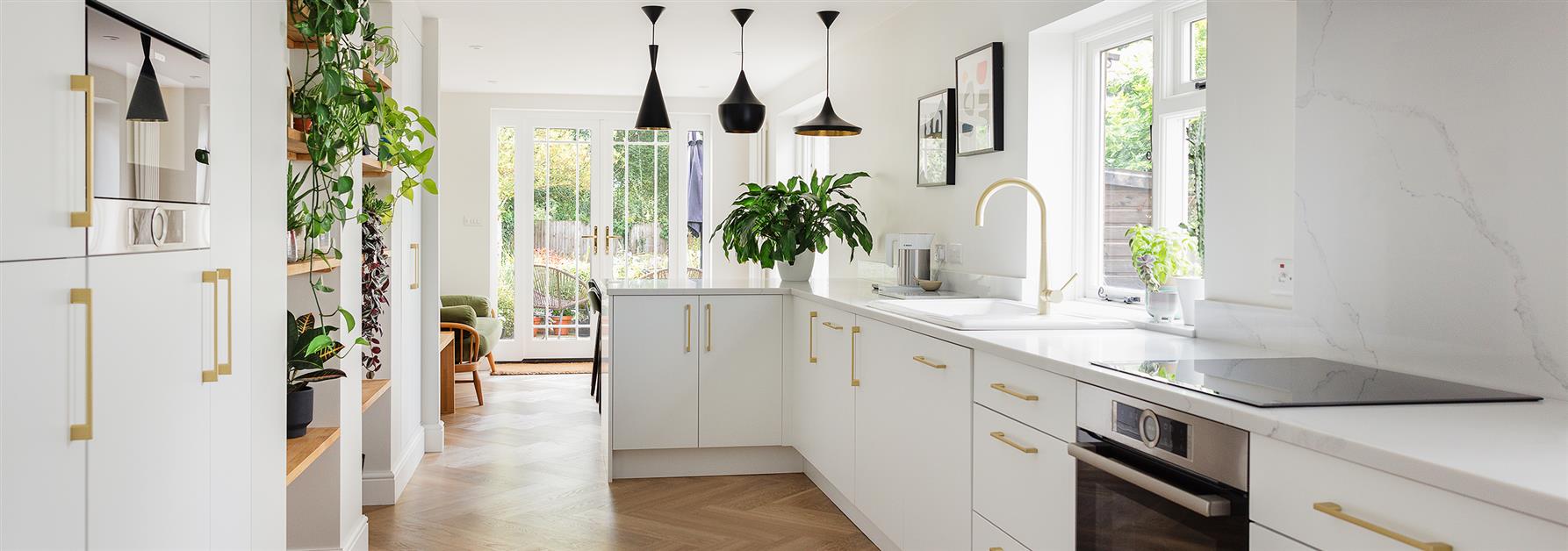
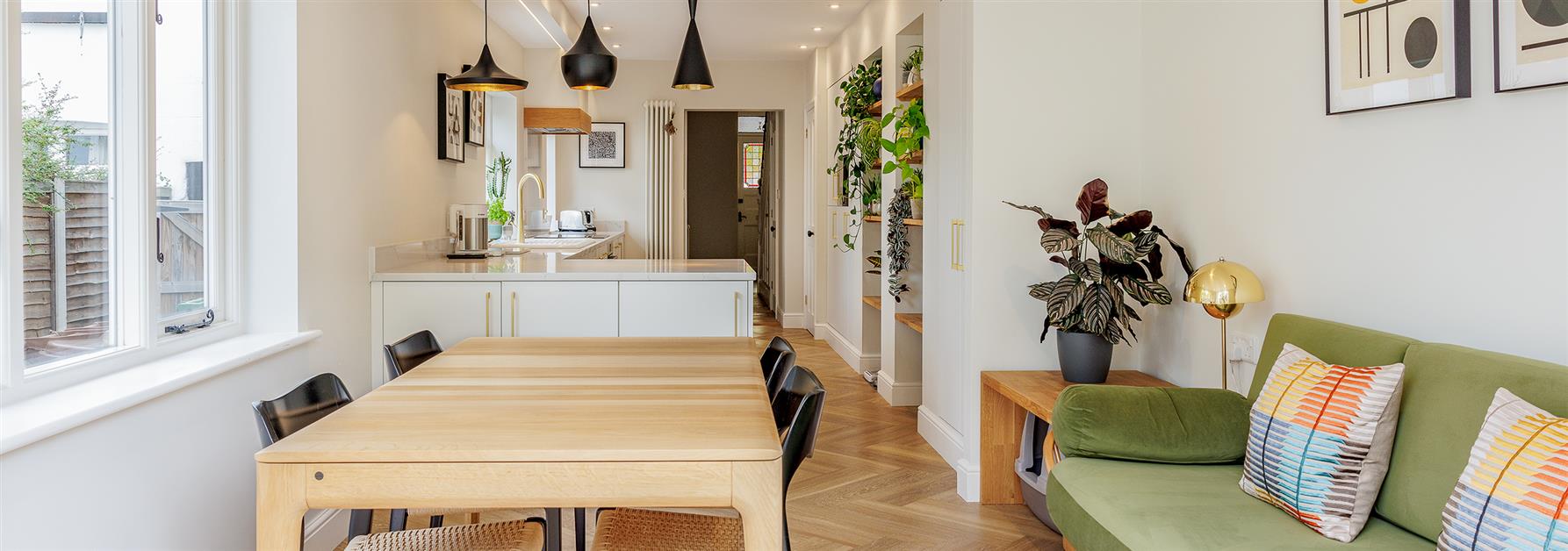
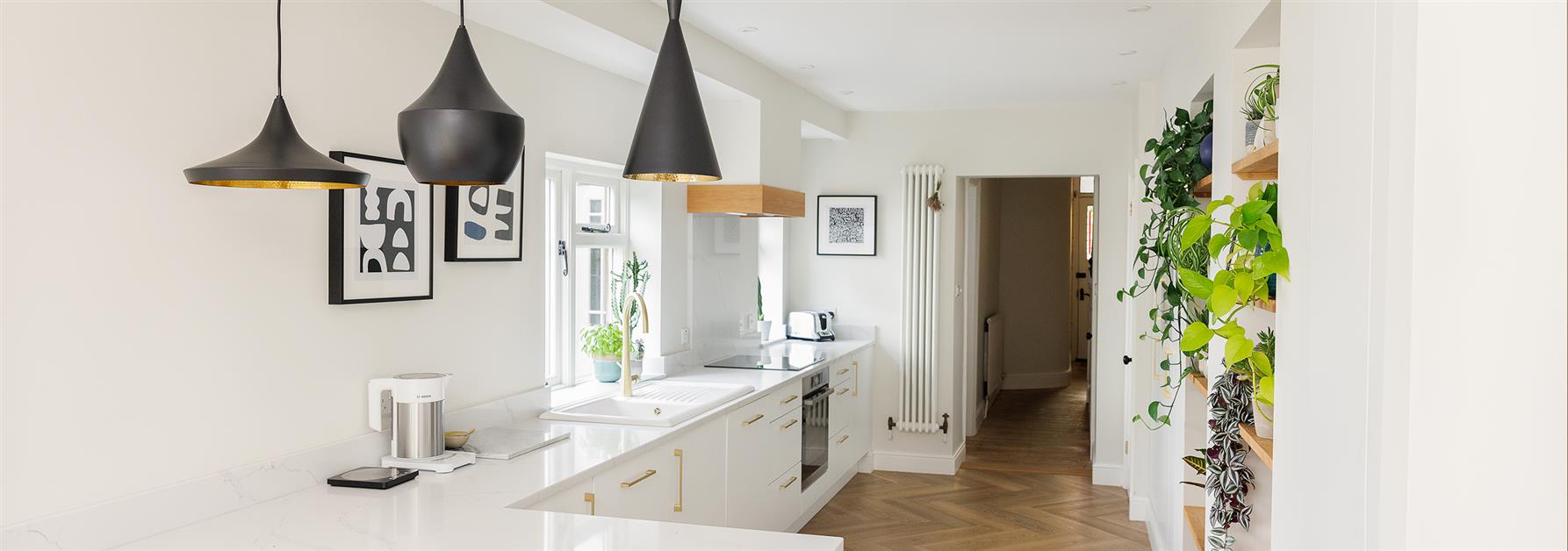
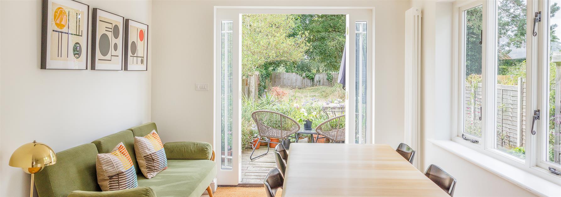
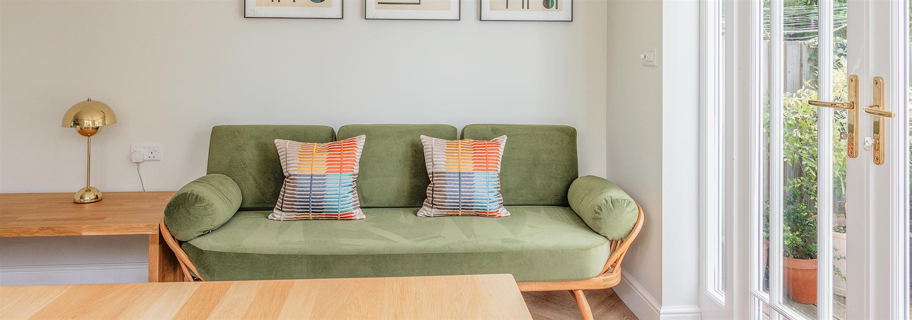
Our brief was to design a kitchen diner with plenty of built in storage, a dining table and a sofa area to make full use of the garden views in a long rectangular space. Mid century detailing was required with an overall bright, light and modern feel.
About The Project

‘This is a traditional Victorian property and has a typical long, narrow kitchen at the back of the house which has been extended at some point. It felt quite dark and narrow with some awkward recesses and angles, but with potential to be really lovely with some careful design work.
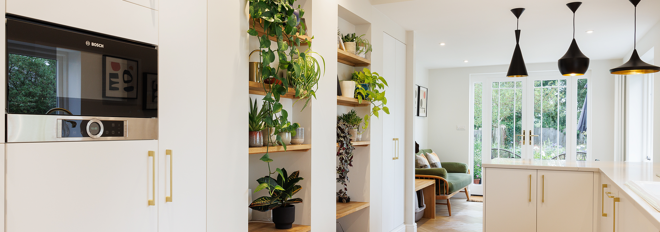
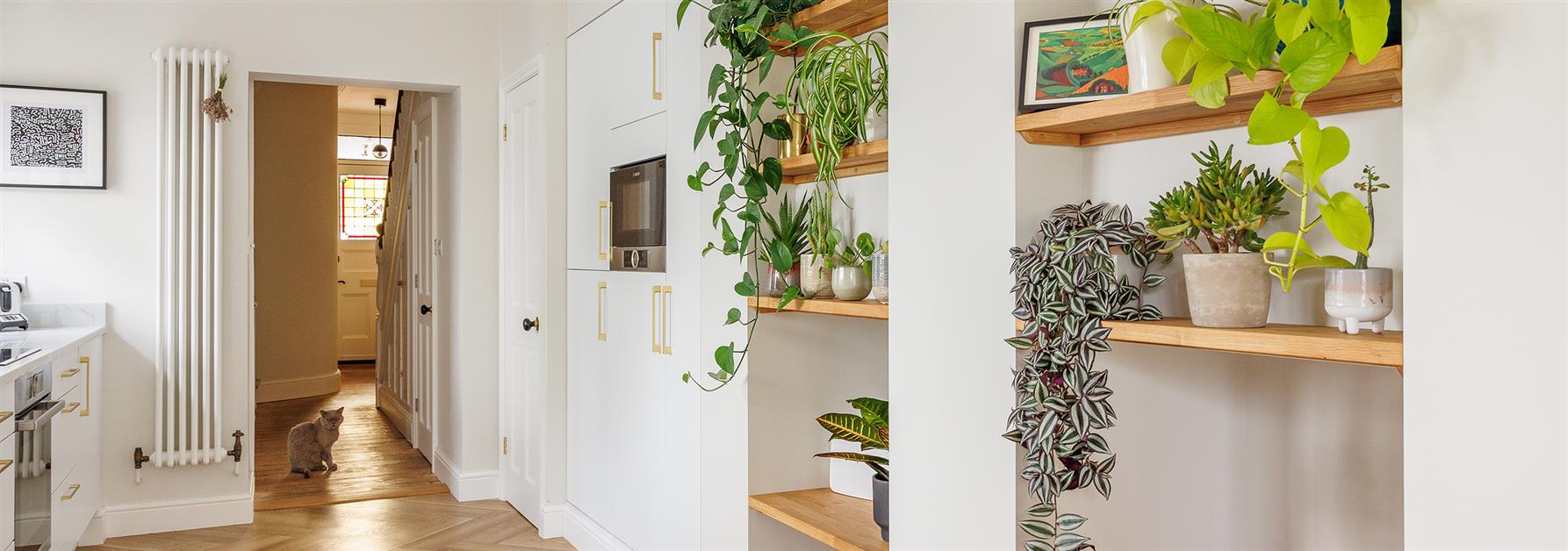
All the dark shadow gaps and awkward angles were lost, leaving a clean-lined space with ample built-in storage. This creates the illusion of a better proportioned and wider room. Simplicity, as they say, is the height of sophistication!
doors more in keeping with the Victorian property which open out fully to maximise the inside-outside space in the summer.
We kept the colour palette light and bright with white kitchen doors and brass hardware, Carrara White marble effect quartz worktops, and then herringbone-style oak effect flooring. Solid oak shelves and mantel added some warmth and texture. Soft furnishings and pictures in a mid-century style add splashes of colour and the black and brass Tom Dixon pendant lights create beautiful geometric silhouettes against the light background'.
Rebecca Coulby

What Our Client Says
We contacted Rebecca about a full-house renovation and how best to break the work down into more manageable chunks. Our initial consultations were fantastic, creative and in-depth, with Rebecca reviewing the whole house, our preferences, priorities, tastes and needs.

