True Colours
COLOUR SCHEMES and adding colour are two of the most common area that I’m asked to advise upon. Most people know the colours they like but are unsure where and how to introduce them into their homes, particularly in the kitchen
My advice is usually to add colour – particularly bold colours – by way of accessories, such as small appliances, tea towels, cups and plates, vases or even cushions, throws and bar stools if you have an open plan kitchen with a seating area. Colours go in and out of fashion and people can quickly fall out of love with a colour if they are faced with it on a daily basis. Keeping kitchen cabinets, doors and wok surfaces to a fairly neutral palette will increase the longevity of your kitchen and will also be an advantage should you decide to sell. I also suggest looking at two or even three complementary colours to brighten up your neutrals. If you just stick to one colour, even if only used in accessories, it can quickly dominate a room. Two colours allow for more flexibility; for example, you could use a softer shade for more permanent fixtures of your kitchen such as pendant light fittings and glass splashbacks or wall tiles, and a bolder colour for the smaller accessories, or even a wall or two, that could be changes quickly and easily if required. Metallica and pastel shades work well together with the metallic giving a modern twist to the more vintage pastels. It is also worth remembering that when adding any darker colour it will always enclose a space, particularly if used on a horizontal area such as a work surfaces as it is closer to eye level. It’s therefore far better to add depth of colour to a floor than a work surface if you are trying to make the room appear as big as possible.
NATURAL COLOURS
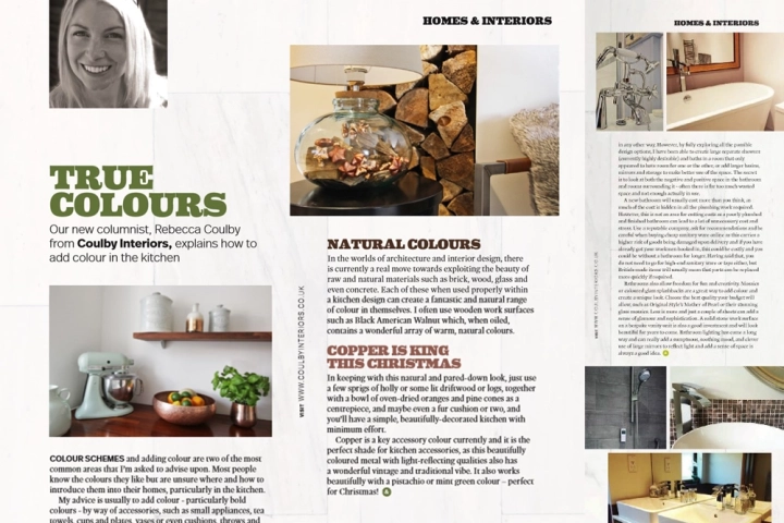
In the worlds of architecture and interior design, there is currently a real move towards exploiting the beauty of raw and natural materials such as brick, wood, glass and even concrete. Each of these when used properly within a kitchen design can create a fantastic and natural range of colour in themselves. I often use wooden work surfaces such as Black American Walnut which, when oiled, contains a wonderful array of warm colours.
COPPER IS KING
In keeping with this natural and pared-down look, just use a few springs of holly or some lit driftwood or logs, together with a bowl of oven-dried oranges and pine cones as a centrepiece, and maybe even a fur cushion or two, and you’ll have a simple, beautifully-decorated kitchen with minimum effort. Copper is a key accessory colour currently and it is the perfect shade for kitchen accessories, as this beautifully coloured metal with light-reflecting qualities also has a wonderful vintage and traditional vibe. It also works beautifully with pistachio or mint green colour – perfect for Christmas.