Contemporary Kitchen Norwich
Location:
Norwich, Norfolk
Project Type:
Home Renovation
Services:
Design, build & installation
The Brief
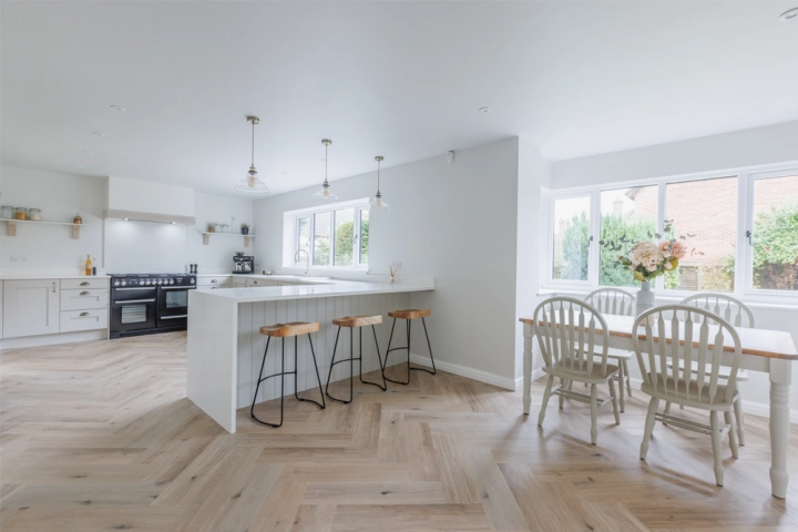
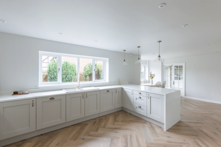
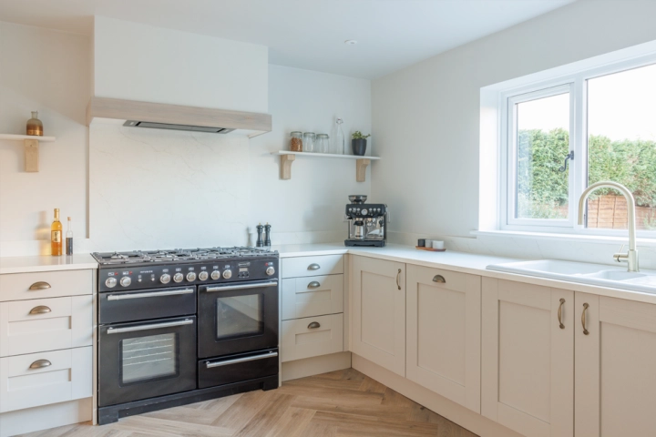
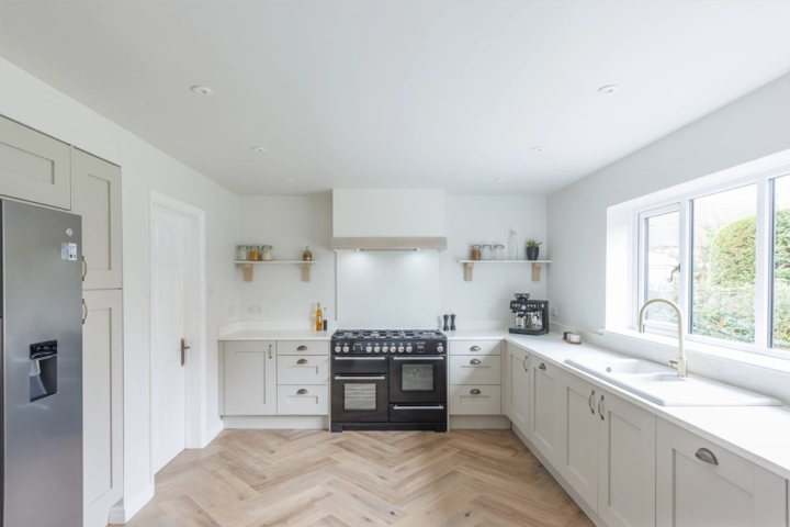
The homeowners sought to transform their existing kitchen into a modern, functional space that seamlessly integrates with their lifestyle. They desired a design that maximises natural light with ample storage, and provided a welcoming environment for both daily living and entertaining guests. The design needed to create a contemporary aesthetic that complements the character of their Norwich home.About The Project
This project formed part of a full house renovation in Thorpe End, Norwich. The property was dated, and the existing kitchen was small, poorly lit, and lacked functionality. The adjacent dining room was also compact and disconnected from the kitchen, making the space impractical for modern living.
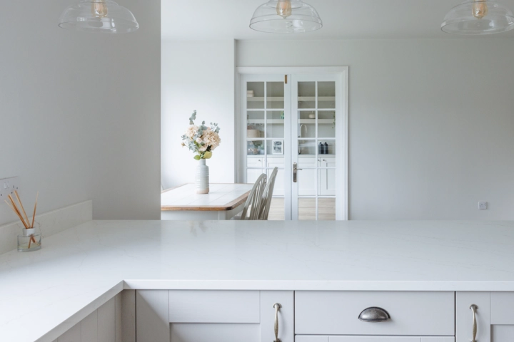
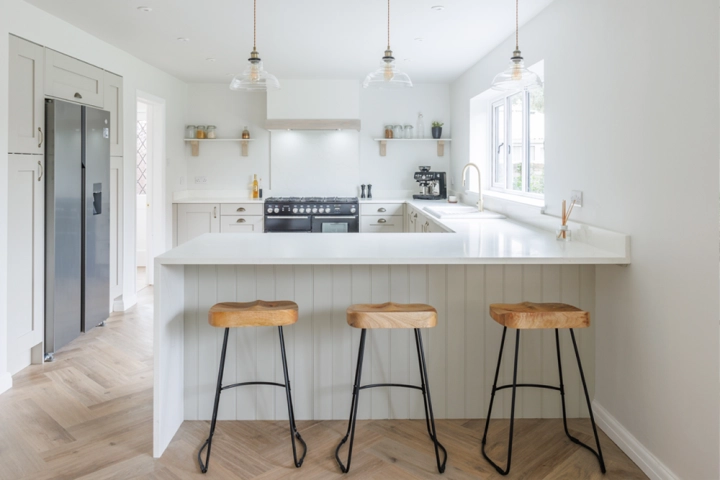
The design solution involved removing the wall between the kitchen and dining room to create a spacious open-plan kitchen-diner. This transformation significantly increased natural light and improved flow throughout the space. A peninsula was introduced to enhance the layout, providing additional worktop space and informal seating.
The aim was to deliver a contemporary, family-friendly kitchen that combines style with practicality—maximising storage, embracing natural light, and offering a welcoming environment for both everyday use and entertaining, all while complementing the character of the Norwich home.
Rebecca Coulby
What Our Client Says
'We can not recommend Rebecca and her team highly enough. From the initial consultation to design to construction the service was exemplary and the quality excellent. We felt engaged throughout the whole process.
